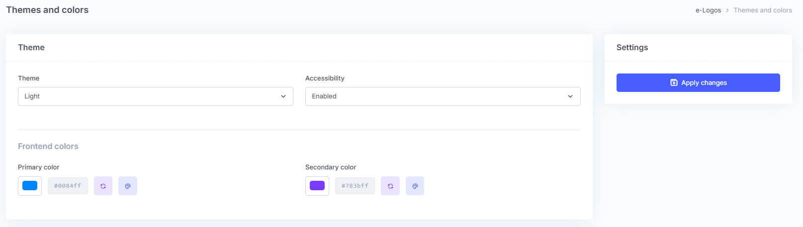
The Themes and colors section contains the settings used to modify the graphic appearance of the page. Using the “Theme” drop-down menu, users can choose the display mode: light or dark. The “Accessibility” menu, if set to “Enabled”, allows the front-end colors to be changed when the feature is active.
The two boxes containing the color codes allow users to select the color of the platform buttons:
primary color: the color of the buttons;
secondary color: the color the buttons take on when clicked.
Colors can be selected from a color table or entered using the hexadecimal code.
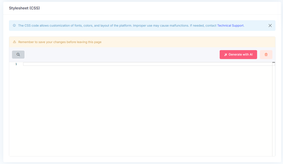
How to edit the CSS
CSS code allows users to customize the platform’s fonts, colors, and layout. CSS must be used carefully: improper use may compromise the user experience.
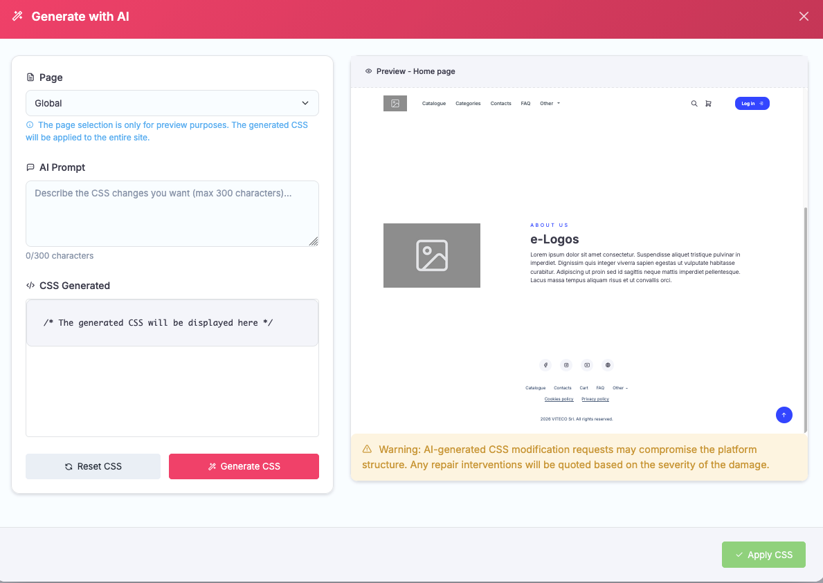
Do you have a style in mind but do not know how to translate it into code? You can use AI. Click Generate with AI, choose whether to apply the style to the entire platform (Global) or to specific pages, describe the desired style to the AI, and generate the CSS. The screen on the right will show a preview of the platform.
Note: the style will be applied only to the front-end. AI uses limited monthly credits.
This site uses cookies to improve users' browsing experience and to collect information on the use of the site.